0%

Share


March 13, 2023
One of the truth bombs that we wish to drop is appearance matters when it comes to graphic design. It is all about visual elements, so the result should be aesthetically appealing and digestible. Design trends may come and go, but the design and user experience’s basics are forever. Today we will talk about some fundamental elements of visual hierarchy and how they can make an actual difference. Being a reliable and emerging favorite graphic design company in Ahmedabad, we offer extraordinary graphic design.
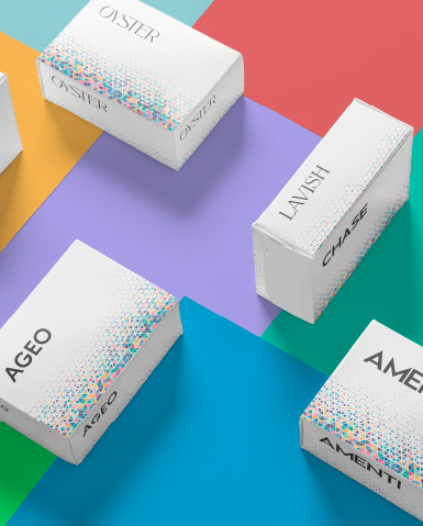
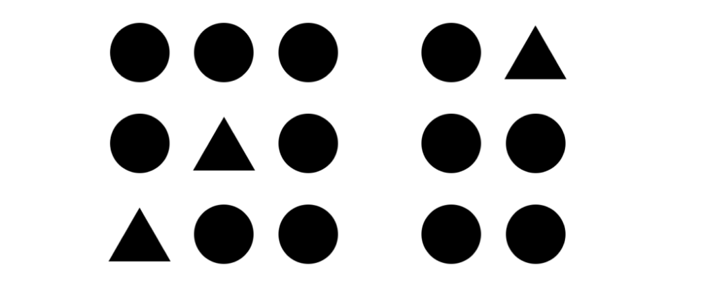
One of the thumb rules in the design that can change the entire visual game is the size of the element. The usual argument is that larger is always better, but the main question is how large the element size should be? The largest element in the design should have maximum emphasis. 90% of the information sent to the brain is visual, and the brain processes images 60,000 times faster than text.
The above example clearly states how the usage of the right size for different elements narrates the story that the storyteller wishes to tell. The size of one element, with respect to the other, allows to create a balance and focus on dominant elements.
Spacing is the key to a neat and beautiful website. It improves the aesthetic and overall message of the website. Negative space is defined as the space between text, graphics, images, margins, and other elements. The negative space dictates how a page reads and flows, plus it allows visitors’ eyes to relax, especially after scrolling through a heavy text page. Here is an example of beautiful usage of negative space:

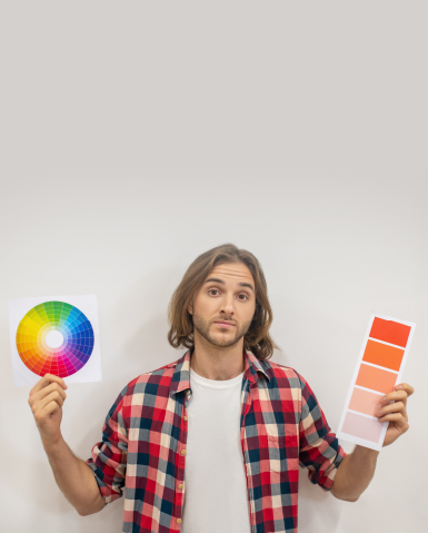
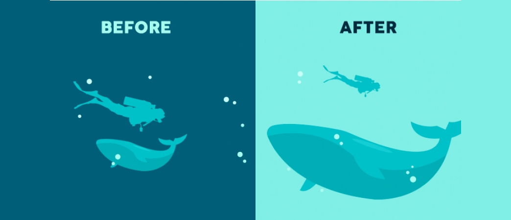
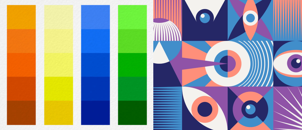
Color and contrast are an important part of the visual hierarchy as they play a vital role in distinguishing core elements. For example, when a user sees colors like orange or yellow, it creates a sense of joy and liveliness. When users see purple or blue colors, it gives a calm and relaxed feeling. Bold colors are easy to use and thus used to highlight objects or set contrast in the visual.
For example, in the above image, you can see how using the same color is ruining the overall experience, and the second image showcases how using color contrast can be impactful for users.
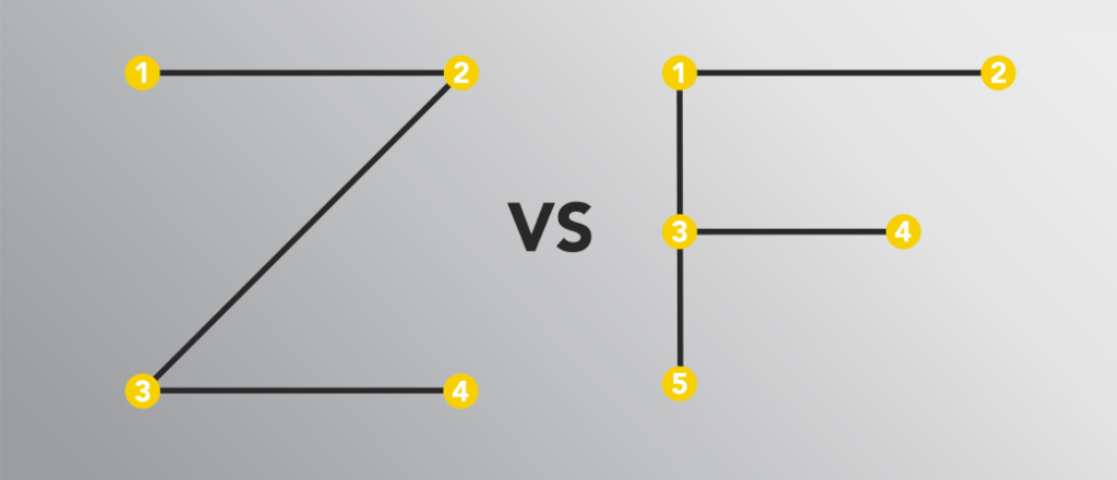
Another essential element that helps design stand out and give a free flow to users is the typography hierarchy. Using different levels indicates the importance of the text. Bigger and bolder typography means important, and smaller and thinner text becomes secondary. There are two patterns through which humans absorb information quickly, whether it is a website, illustration, or printed article. These two patterns include F Pattern and the Z pattern.
Another element to consider is the illusion of depth, and an illusion of depth can range from a few inches to several miles. In layman’s terms, it is a way of manipulating space, and depth can be created in various ways like focus, overlapping, light, shadow element, etc. Depth pushes two-dimensional surfaces into three-dimensional surfaces. There are multiple ways to add depth, including aerial perspective and optical.
Proximity is a key rule in the visual hierarchy. In web design, some items need to be separated while some grouped down. Proximity helps to segregate the same type of content in one place and other types in another place. The main purpose of proximity is to create a spatial relationship between different components that can tell a story or make sense in design.

The right alignment of elements is necessary as it is important to align elements when you have plenty of text or images in the design. As mentioned above, the F or Z pattern can be used to align them to make them perfectly aesthetically appealing. If elements are placed randomly, then the entire design can lose its appeal.
Balancing the overall composition of the design is very necessary for designers, and this is where the rule of thirds can be used. It is mainly used to get the best visual results. In this, a design or image is divided into different sections using rows and columns to form a grid. With this rule, you can plan out the important element placement in the design.
The above discussed are some foundational principles of visual hierarchy in graphic design. By using these principles, you give a clear and understandable message to the audience. If you wish to hire the services of graphic designers in Ahmedabad, Pixenite should be your choice. We have an in-house team of expert graphic designers with plenty of experience working for different industries.