0%

Share


March 29, 2023
Color is a language that helps to articulate the purpose of brands or creatives, as it has the power to directly influence the soul. Branding colors need to be chosen wisely. Brand colors are a certain number of colors used by the brand for a company’s online or offline representation. Strategic and consistent use of the chosen brand color helps to boost recognition and awareness about the brand. Take the help of a branding agency in Ahmedabad like us to unleash the next level of business.
Do you know color can boost brand recognition by 80%? When you constantly use certain brand colors it becomes a unique representation of your brand. Using certain colors consistently in your ads and other branding materials from the beginning helps to establish a strong connection between those colors and your brand.
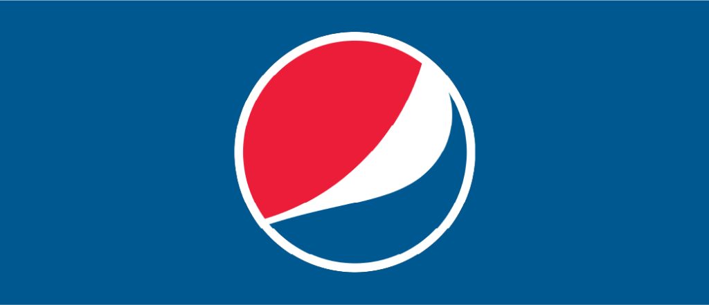
We’re guessing the signature red, white, and blue is above enough to help you recognize Pepsi before even reading the brand name. Colors help to strengthen brand recognition by about 80%. Look around you and see if a particular color reminds you.
Growing in the competitive world is the most difficult challenge for most brands. Brands need to consistently make an effort to retain their position in a crowded marketplace. Even when walking through a supermarket you might be able to recognise several brands that you can recognise without actually reading labels.
Some colors have certain interpretations in different industries. For example, the pink in healthcare brand’s logo represents cancer-related care. Blue is also a common color in this industry as their primary colors in their logos. You must also understand the color’s psychology and terminology that your competitors are using. You must also consider how color can affect the visual aspect of the brand amongst competitors.
Another important thing to consider while finalizing color for the brand is the brand’s personality. Imagine your brand to be a human being and then decide how you like this human being to be: serious, funny, playful, vibrant, warm, relaxed, or anything else. Choose the color that best suits your brand’s personality and not your personal preferences.
Almost every brand has a certain target audience based on their buying behavior, age, geographical location, gender, etc. Take an example of Facebook where the target audience is the young demographic while LinkedIn is for people to form business connections.
If you are still confused, let us help you. If your target audience is children aged 5 years or above then for vibrant colors like yellow, green, and blue color; in case your target audience is nature’s love then go for green or brown color for the organic impression.
Launching a website, mobile app, social media channels altogether in the same color palette at the initial level is not a good idea. We suggest doing certain experiments with colors before finalizing your brand’s palette. Start by designing a logo for your brand using a specific color and then tell your targeted audience about the color choice or you can conduct a survey or do it any other whatever you prefer to get the targeted audience’s opinion.
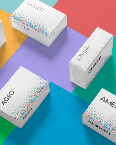
Having too few or too many colors in your brand color palette may not achieve the desired result. Therefore, we recommend that your brand color palette should have no more than five colors. You can take help of following guide to find out your brand color palette:
After identifying the personality of the brand, the next step is to find the right colors that can do justification to its personality. Let us help you by telling you how certain colors are associated with certain emotions.
The information discussed above is a guide, but it is important to remember that there are no concrete rules for choosing particular branding colors. Branding is all about consistency, better services, and efficiency. You can hire a branding agency in Ahmedabad to elevate your branding’s standard. Team of experts will help to meet your business’s goals with smart strategies and better executions.