0%

Share


April 14, 2023
Colors play a significant role in brand identity and recognition. They can influence people’s emotions, perceptions, and behaviors, making them an essential component of logo design. A well-designed logo must use colors that resonate with the target audience and communicate the brand’s values and personality. Pixenite is a trustable branding agency in Ahmedabad and is known for its spectacular services.
In this blog, we will discuss the different color combinations that businesses can use for their logos, along with their psychological impact and real-life examples.
One of the best methods to establish brand identification is through color. Customers start to connect a brand with certain colors when they see those colors frequently in its logo, advertising, and packaging. Think of Coca-Cola, for instance, when you see a red can with a white ribbon. Consistency in color usage can help your brand stand out in a crowded market and create a lasting impression on consumers.
Colors can also communicate a brand’s personality and values. For example, green is often associated with environmental friendliness and sustainability, while purple is often associated with luxury and sophistication. You may choose colors that will appeal to and have an effect on the behavior of your target audience by understanding the psychological effects of various colors.
Colors can also influence consumer behavior. For example, blue is often used in corporate logos because it is associated with trust, stability, and reliability. On the other hand, red is often used in sales and marketing because it is associated with excitement, urgency, and passion. By understanding the psychological impact of different colors, you can choose colors that will appeal to your target audience and influence their behavior.
Colors can also help your brand stand out from competitors. For example, if your competitors are using blue in their logos, choosing a different color like green or yellow can help your brand differentiate itself in the market. By choosing unique color combinations, you can create a logo that is memorable and distinctive. You can take help from a branding agency near you to understand the color psychology.
Finally, colors can also impact how your logo appears on different platforms. For instance, some blue hues may seem differently in print than they do on a computer screen. When designing a logo, it is important to consider how the colors will look across different platforms to ensure that your logo appears consistent and recognizable.
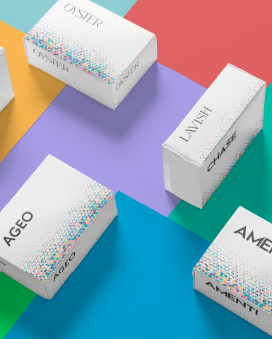
The monochromatic color scheme uses different shades of a single color in the logo. Luxury brands frequently choose this color scheme because it gives off a polished and elegant appearance.

Some examples of monochromatic logos include:
The complementary color scheme uses two colors that are opposite each other on the color wheel. This color combination creates a high-contrast effect and is commonly used by brands that want to stand out and create a sense of excitement.

Some examples of complementary logos include:
The analogous color scheme uses colors that are adjacent to each other on the color wheel. This color combination creates a harmonious and cohesive look and is commonly used by brands that want to convey a sense of stability and reliability.
Some examples of analogous logos include:
The triadic color scheme uses three colors that are evenly spaced on the color wheel. This color combination creates a vibrant and energetic look and is commonly used by brands that want to create a sense of excitement and playfulness.

Some examples of triadic logos include:
The split complementary color scheme uses a base color and two colors that are adjacent to the complementary color. This color combination creates a balanced and harmonious look and is commonly used by brands that want to create a sense of sophistication and elegance.

Some examples of split complementary logos include:
Conclusion
Choosing the right color combination for a logo is crucial in creating a successful brand identity. Each color scheme has its own unique benefits and can be used to convey different messages and emotions. If you are still unsure what to choose, take help from an expert branding agency in Ahmedabad. Our team of experts has immense years of experience in shaping your business personality. Let us create a memorable and impactful logo for you that resonates with their target audience.