
0%
-Martin LeBlanc
There is no denying the fact that UI plays a vital role in the success of websites or mobile apps. In the digital era, user interaction matters the most. According to a study by Microsoft, our attention span has just dropped to eight seconds, meaning you can make or break a deal in just eight seconds. In this period, you can't afford any UI or user experience design mistakes that can kill your brand. Let's have a look at some of the statistics related to User Interface.
We all should learn from our mistakes; you can learn from the top common UI design mistakes to avoid the mess, and you can thank us later.
The great art of designing a successful app or website lies in small nuances. We all may have used a website or application in the open area under the sun. It's great if the background color and font contract allows us to recognize text or words. But in case, if not, think twice before combining a strong background color with gray fonts; that is the most mismatched combination that proves to be a waste of time and effort. We suggest using white fonts for dark-colored backgrounds.
The great art of designing a successful app or website lies in small nuances. We all may have used a website or application in the open area under the sun. It's great if the background color and font contract allows us to recognize text or words. But in case, if not, think twice before combining a strong background color with gray fonts; that is the most mismatched combination that proves to be a waste of time and effort. We suggest using white fonts for dark-colored backgrounds.


Dominos was sued by a blind man who could not access the official website. It is often seen that we're trying to design what looks good and often ignore the thought of how different users will interact with the product. The low contract can directly lead to low usability.
There is no denying the fact that popups are a great way to drive traffic to the website, but too many popups can irritate users. Too many popups will have an adverse effect on a website's search rankings. The popup that appears before the page gets loaded indicates that the website or app is desperate and frustrates the users. Never ever show the popup before a user receives gleaned value from your mobile application or website. The popup before the page gets loaded indicates that the website or app is desperate and frustrates the users.

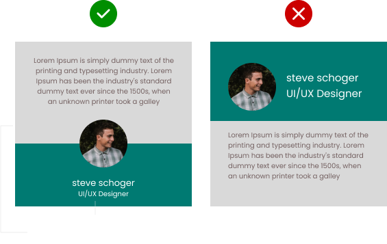
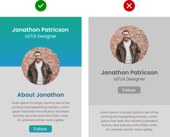
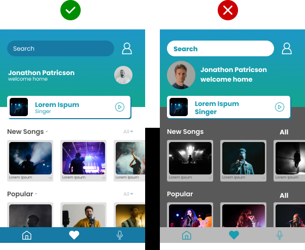
Too many different styles often create confusion and send mixed signals to users. A consistent design and elements help the brand get better recognized and build trust amongst visitors.
When you design a set of icons, then it should feel like a family, not distant relatives; they may not look the same but should have familiar attributes making them feel related.


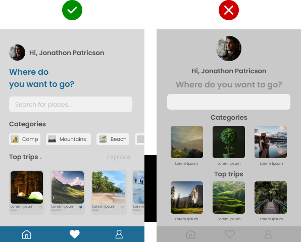
Complex navigation is one of the significant drawbacks of the website; one needs to understand that users have not come to your website to solve any kind of treasure hunt. Simple is never out of fashion and style.
Do you like cluttered information, or do you prefer more organized information? You cannot afford to go wrong with the text, as it should be organized and legible. Users will abandon an app or website if there is no text hierarchy; the designer must organize it in a more digestible and comprehensive way. Whitespace, also known as negative space, plays a significant role in making it more readable, so use it wisely; too much or too less space can create chaos.
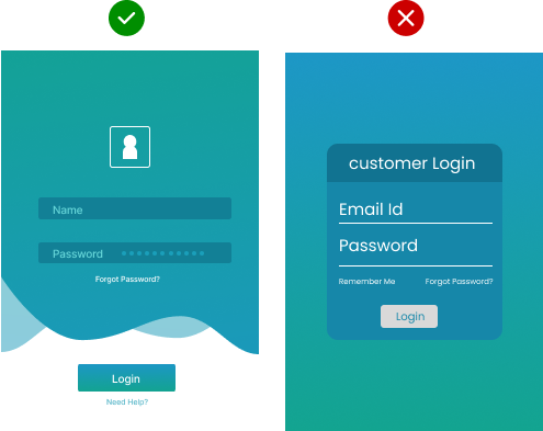
Forms are an integral part as it acts as a communication channel between users and business. A badly designed form can destroy the business purpose and leave a poor mark on users' minds. It is important to use labels while designing the form, as nothing is more irritating than guessing what to put in the input field. Never use a z-pattern design; instead, use a vertical form.
The ultimate goal of the UI designer is to provide an aesthetic and intuitive interface that must help gain the users' trust. We hope you will keep all the UI mistakes mentioned above in mind while designing an app or website. It's up to a UI designer whether to make or break the deal. In order to avoid such lethal mistakes, hire an experienced UI company. We are an emerging and reliable UI UX design company in Ahmedabad.
